TypeMedia Recommended Reading
Currently this is an informal reader, a list of useful books and of articles for the student interested in typography and typedesign. This list is not complete, nor does it claim any authority. It was compiled by a real person looking at actual books, so that might be a plus.
These are amazing books, but this is not a shopping list! You can borrow many of them at the TypeMedia office (if you’re a student).
In a time where AI companies buy old books in order to scan and destroy them, it is more important than ever to do everything to preserve critical books and reference material. Because damn AI and all those who use and support it.
Hypothetical Noordzij Book Club
In Quærando vol.25, no.1, 1995, pp.59-71, “The mannerist writing-book and Stanley Morrison, In honour of Johann Neudörffer”, Gerrit Noordzij writes: “So collect your sympathy for the editor’s belief and pile around you the picturebooks that would compensate for the lack of illustration. Minimally you should have the following set at hand:
Oscar Ogg, Three classics of Italian calligraphy,
Cresci, Essemplare,
Alred Fairbank & Berthold Wolpe, Renaissance handwriting,
Alfred Fairbank, A book of scripts
Werner Doede, Schön schreiben, eine Kunst.
Not sure whether these are easy to find, but it is always nice to find a suggested list.
Tim Ahrens, Shoko Mugikura, Size-specific adjustments to type designs. An invstigation of the principles guiding the design of optical sizes. Munich: Just Another Foundry, 2014 [190 pp]. 2014
Based on Tim Ahren’s dissertation for the MA Typeface Design at the Department of Typography and Graphic Communication, University of Reading. First edition published in 2008.
Ken Barber, House Industries Lettering Manual. California: Watson-Guptill, 2020 [198 pp]. 2020
“From the highly acclaimed creative studio House Industries, comes this handy how-to guide chock-full of everything you need to know to produce prefessional hand-lettering—whether you’re an experienced artist interested in broadening your skills, or just a curious novice in need of eye-catching yard sale flyer. Jam packed with detailed drawing techniques, convenient reference models, invaluable skill-building exercises, and real world case studies, this illustrated instruction manual reveals the secrets for creating virtually any letter style in nearly every design scenario imaginable. More important, you’ll learn simple and easy-to-use step-by-step methods for making alluring and effective lettering all the way from concept to completion.” Index and a list of recommended reading.
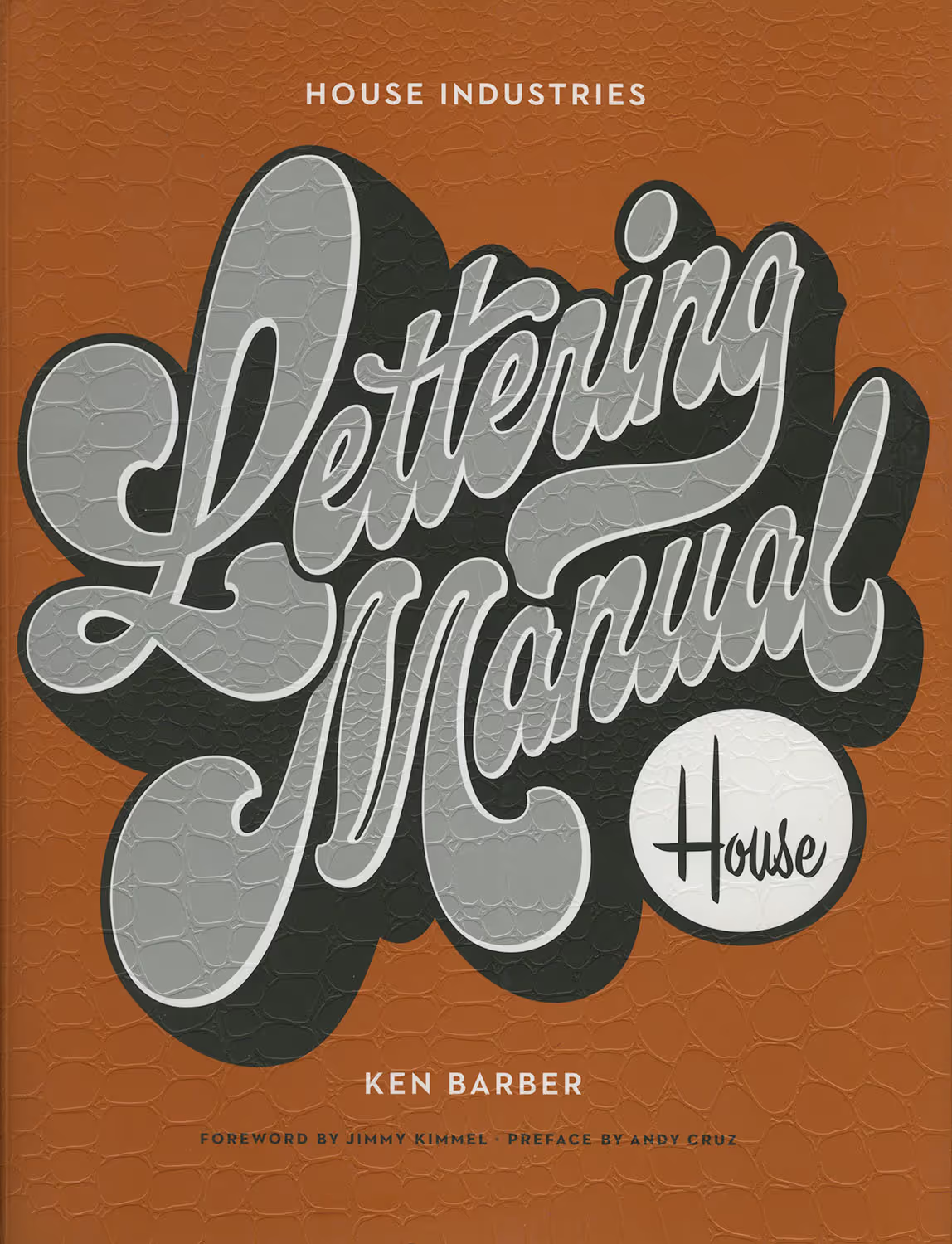
Image: House Industries
Françoise Berserik, Lettercarving for typedesigners. The Hague: Erven Berserik Uitgeverij, 2024 [84 pp]. 2024
‘This handbook was written for the students of Type and Media. Its aim is to explain how to carve letters in stone. It describes the course, which consists of a sequence of three carving exercises and many practical aspects relating to these, such as choosing and preparing stone, learning about tools, and sketching and making a new drawing for lettering that is suitable for carving.’
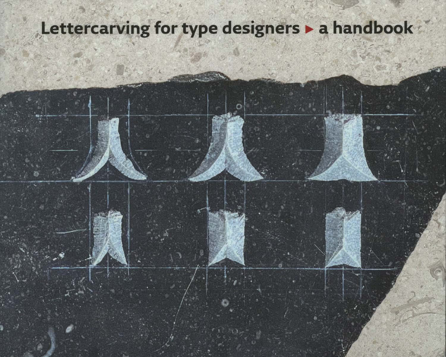
Image: Berserik
George Bickham, engraver, The Universal Penman. London: 1743 [212 p]. 1743
Modern edition by Dover Publications, Mineola, New York. “George Bickham, a noted engraver and calligrapher, first compiled this work back in the 1740’s, from the best specimens of 24 of the leading calligraphers of his day. UnfortunatelyBickham published his work in 52 separate parts over a period of eight years. In Bickham’s own day it was difficult to get a complete set of the Universal Penman.”
Harry Carter, Optical scale in type founding. Printing Historical Society Bulletin, vol.13, 1984 pp.144-8. 1984
The article below and on the next four pages first appeared in Typography 4 of autumn 1937. Typography was edited by Robert Harling.
→ PDF
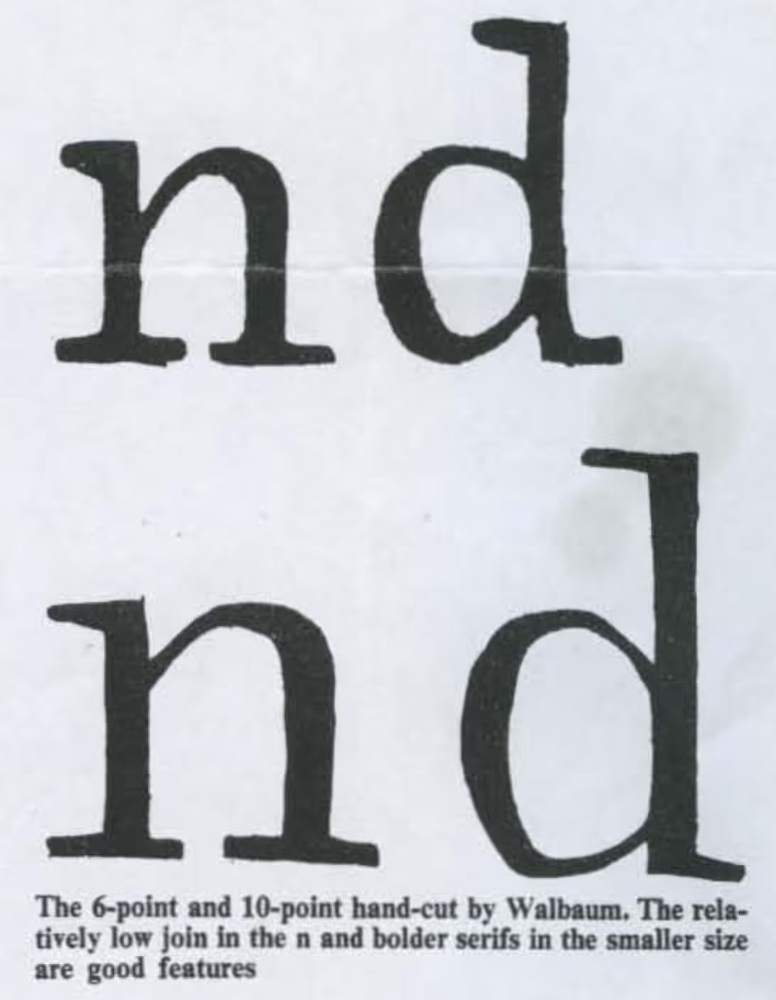
Image: Printing Historical Society Bulletin
Edward M. Catich, The Origin of the Serif. Brush Writing & Roman Letters. Davenport, Iowa: Catich Gallery St Ambrose University [312 p]. 1968
“This handsomely illlustrated book goes beyond a discussion of the serif. Here you will find a new approach to the history, lineage, and development of our alphabet, a detailed explanation of letter cutting in stone, the manner in which the brush differs from all other writing tools, and the role it played in the shaping of our classic Roman alphabet, with a wealth of other information pertinent to the graphic arts, including an account of the early twentieth century Chicago sign writing and its relation to Imperial Romain epigraphy.”
Alfred Fairbank, Berthold Wolpe, Renaissance Handwriting, An Anthology of Italic Scripts. London: Faber and Faber [104 p + 96 plates]. 1960
Fairbank’s introduction discusses different handwriting practices in the Renaissance. Quills, proportions, ink etc. Wolpe wrote notes on the 96 plates.
Mathieu Lommen, John Lane, Bram de Does, typographer and type designer.. Amsterdam: Uitgeverij de Buitenkant [312 p]. 2003
“Bram de Does is best known internationally as a type designer, and the influence of this Trinité and Lexicon on younger designers is undeniable. […] This monograph is the first comprehensive publication devoted to De Does’ life and work. It places his book and type designs in a broader context, and includes seven contributions by prominent designers on De Does’ typefaces in their design practice. It also provides an extensive bibliography.”
Nicolete Gray, Ray Nash, Nineteenth Century Ornamented Typefaces. London: Faber and Faber [238 p]. 1976
“This classic work, originally publised in 1938, has been revised by the author for the present new edition in larger format. It is still the only book devoted to this brilliant initial period in the history of display type design. Chapters on nineteenth-century layout, and the final decade 1890-1900 have been added; also a chapter on nineteenth-century type by Professor Ray Nash.”
W. Pincus Jaspert, W. Turner Berry, A.F. Johnson, The Encyclopaedia of Typefaces. New York: Barnes & Noble [420 p]. 1970
On the fourth edition: “[…] This edition is redesigned in a larger format and with more than four hundred and fifty faces reset to provide better representation and the type faces have been reclassified under the new British Standards Classification for easier reference.” All editions of this book are useful as the authors collected a wide range of typefaces from different manufacturers, often noting designers, punchcutters and notable differences between releases.
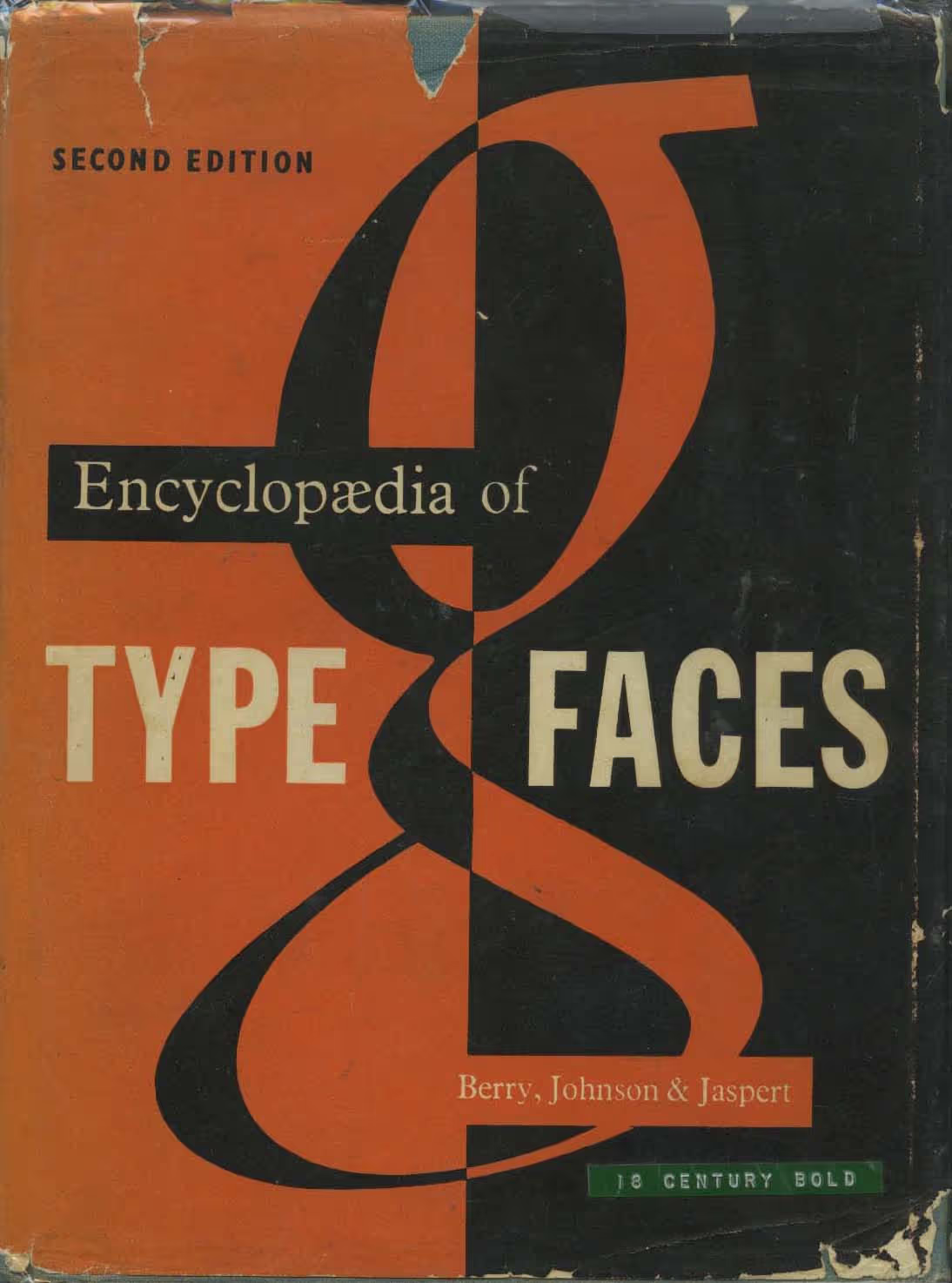
Very worn copy of a second edition Jaspert. But you know what: any copy of this book is useful.
Bruce Kennett, W.A. Dwiggins. A Life in Design. San Francisco: Letterform Archive [484 p]. 2017
“Designer of books and types, calligrapher, illustrator, marionette engineer, and writer. W. A. Dwiggins was one of the most influential and innovative designers of the twentieth century, but what’s less known is the scope of his creativity, the fullness of his impressive body of work, and the inspiring attitudes with which he faced every challenge in life.” Many illustrations and reproductions. Extensive sources and notes.
Robin Kinross, Modern Typography, an essay in critical history. London: Hyphen Press [192 pp]. 1992
“In a survey of developments since 1700, this book proposes new understanding of modern typography: as something large and more deeply rooted than a modernism of style. Rather, ‘modern’ is taken to imply an articulate consciousness of action. The book’s treatment lays stress on debates over principle and explanations of practice But full weight is given to the social, technical and material bases of the activity.”
James Mosley, The Nymph and the Grot. The Revival of the Sanserif Letter. London: Friends on St Bride Library [56 pp]. 1999
“Updated version of an article originally published in Typographica, new series, volume 12, December 1965. Mosley emphasises the importance of the rediscovery of classical architecture for the introduction and development of letter-forms without serifs in late eighteenth-century England.”
Gerrit Noordzij, Broken scripts and the classification of typefaces. The Journal of Typographic Research, vol.4, no.3, 1970, pp. 213-40. 1970
Written as a review of Walter Plata, Schatze der Typography, gebrochene Schriften (Frankfurt on Main), this is the first publication of Noordzij’s contrast origin theory.
→ PDF
Gerrit Noordzij, The stroke, theory of writing. The Hague: Royal Academy of Art, Amsterdam: Uitgeverij de Buitenkant, 2021 [86 pp]. 2021
Reprint of the 2009 Hyphen Press edition with minor text corrections. New cube illustration by Just van Rossum. Available in different editions and languages.
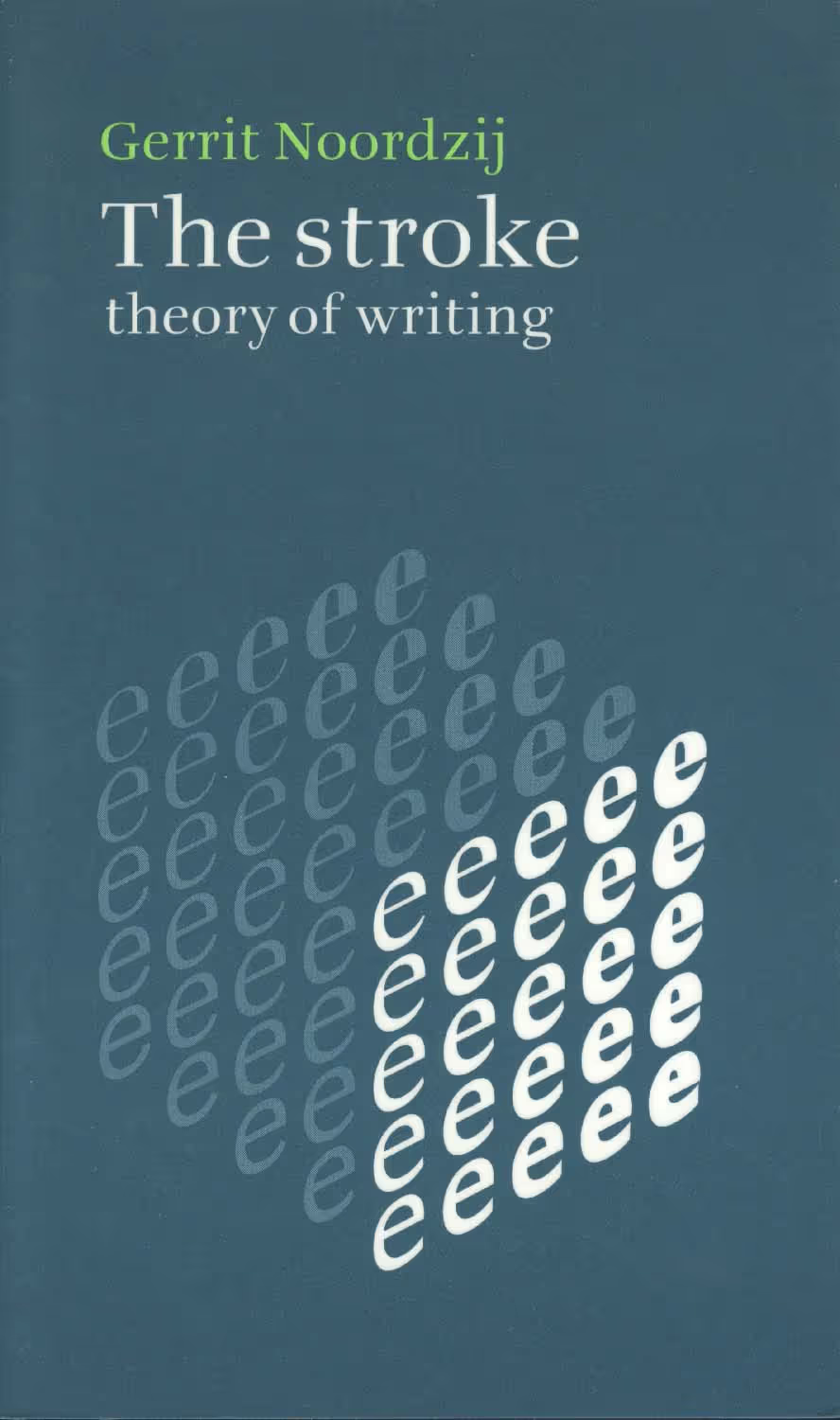
Did you see the list of translations?
Fred Smeijers, Counterpunch. London: Hyphen Press [192 pp]. 1996
“Western typography is still dominated by letterforms designed in the first hundred years of printing. What were the processes behind these forms? This book provides a close-up view of the work of these sixteenth-century French and Flemish punchcutters.”
Albrecht Seemann, Handbuch der Schriftarten. Leipzig: Albrecht Seemann Verlag [174 pp]. 1926
Overview of typefaces published in the German market. Fraktur, Antiqua, “Reklame und Zierschriften” Listings for Linotype and Monotype machines. Useful reference for typefaces that were produced at different foundries under different names. Additions were published in 1927-39.
David Shields, The Rob Roy Kelly American Wood Type Collection. A History and Catalog. Austin: University of Texas Press, [406 pp]. 2022
“The Rob Roy Kelly Wood Type Collection is a comprehensive assemblage of wood type manufactured and used for printing in the United States during the nineteenth century, gathered from the late 1950s to the mid-1960s by the noted design educator, collector, and historian Rob Roy Kelly (1925–2004). No collection can be complete, but this one, with its nearly 150 faces, does provide an excellent overview of the most popular printing types used in the nineteenth century.”