Gerrit Noordzij’s school of letters
Jan Middendorp
Until the early 1980s, the Department of Graphic and Typographic Design of the Koninklijke Academie van Beeldende Kunsten (KABK, Royal Academy of Fine Arts) in The Hague seemed to be a school like any other, producing respectable book typographers as well as designers capable of doing sound corporate identities. When typefaces designed by KABK students began to be published around 1983, it gradually dawned on the outside world that the Academy prepared students for an occupation which few people knew existed — that of type designer. With the advent of desktop computing and the globalization of digital typographic culture, fonts by former students of the Royal Academy quickly conquered the international design world. Type designers from the ‘school of The Hague’ provided the new technology with useful tools and ideas.
The man who single-handedly brought about this small miracle was Gerrit Noordzij, who began teaching at the KABK in 1960, and from 1970 onwards developed an ambitious ‘letter programme’ for design and art students. I use the word ‘letter’ — as opposed to the more specific type, lettering, or writing — because this word in Dutch has all these meanings at once, and it is the term Noordzij prefers, even when writing in English, to define his field. As explained on pp 150 ff. [Dutch Type], there is no essential difference for Noordzij between handwriting and printing type: ‘typography is writing with prefabricated letters.’ Noordzij’s clear theory about the construction of letterforms provided his students with a sharp tool to analyse and criticize existing alphabets as well as their own.
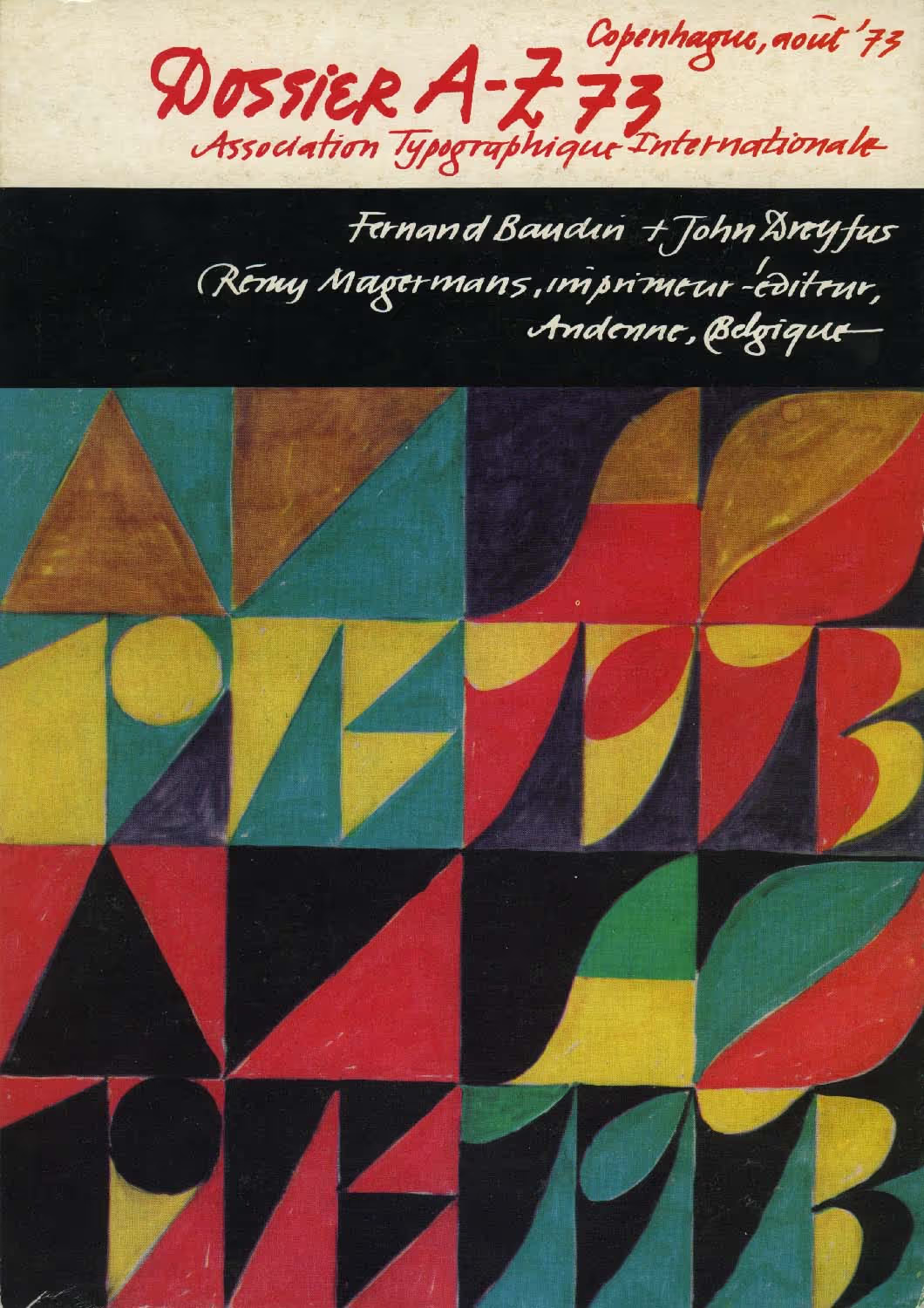
The letter programme was never actually meant as a curriculum for training type designers. The following is a fragment from Noordzij’s text for Dossier A-Z 73, a file on ‘Education in Letter Forms’ prepared for the 1973 ATypI conference. It was quoted in a 1996 article by Frank E. Blokland, who pointed out that Noordzij’s synopsis of type education at the KABK had remained valid to date. ‘This programme [does not have] the ambition of producing highly qualified type designers. It has a modest place in the course of graphic design at the Koninklijke Academie, The Hague. This programme should make our students independent of trends in typography. They will have a notion of the problems that arise from enlarging letters, from making letters three-dimensional, from changing colours and printing techniques, etc. For advanced studies in letterforms the programme should provide a solid foundation.’ Besides being a type designer, writer and letter carver, Noordzij is also a respected book typographer and graphic designer. These are the disciplines in which many of his former graphic design students from the 1970s excel. During that decade, no KABK graduate chose to be a type designer. This was, at least in part, due to outside circumstances. The reigning fashion in graphic design — ‘functionalism’ inspired by Swiss typography — did not call for a great variety of new typefaces. Type production in the Netherlands had practically ground to a halt, and the international type world was a virtually impregnable fortress. Young type designers from The Hague were to be instrumental in changing that situation.
Published in Dutch Type, 2004, Letters from The Hague, p.176.
ATYPI
Gerrit Noordzij ‘A program for teaching letterforms’ Dossier A-Z: Association Typographique Internationale 1973. Andenne: Rémy Magermans, 1973, pp.80-8"